Florence & Bologna, Dep. of Tourism
+ VISUAL IDENTITY
+ STATIONERY & COLLATERAL
+ SIGNAGE
+ ART DIRECTION
This project was born of my experience studying abroad in Florence for five months. It was my first experience traveling abroad, and my creative process has since completely reset. The people, as well as the experiences we shared, inspired this redesign of the official tourism department of Florence. No matter where we traveled, Florence felt familiar to us journeying designers. This identity is a love letter to my third home city.

Logo Concept
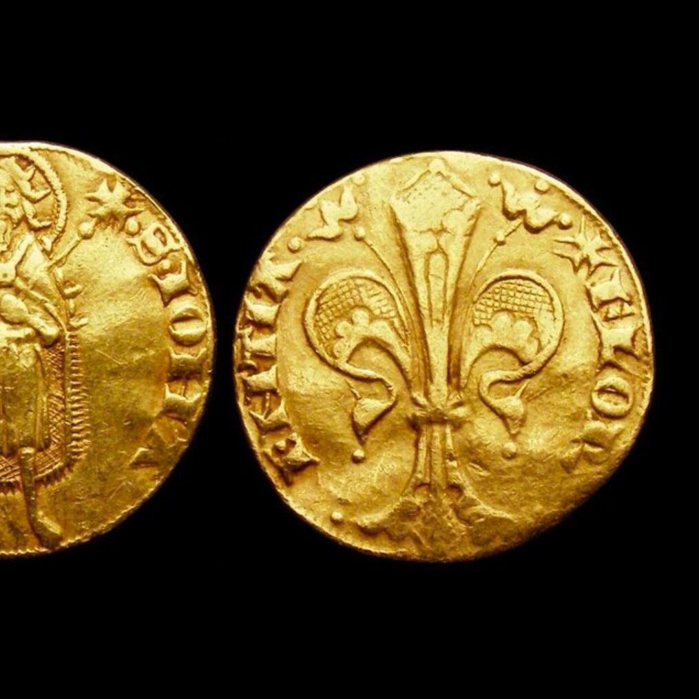
Narrow, curving streets carry you towards your next adventure, the same harrowing routes that Dante and Da Vinci took centuries before you. Nowhere else does the past seem so perceptible, and yet this past remains pertinent to tourists and locals alike. Beyond the initial disorientation awaits a perfect harmony, perfected by the likes of Brunelleschi, Raffaello, and Michelangelo. The logo reflects the gold florin, a symbol of Florence’s flourishing condition and independence, as well as the Tuscan sun that illuminates the two cities’ architectural, artistic, and scientific treasures.


Typography


Digital Interface

